When I was in the rat race, one of the many things that was really getting on my nerves towards the end was how my department thought it could do away with professional services and do things itself. All to save money, of course.

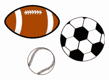
'Balls' Advertising Campaign
As far as not using design services goes, using Microsoft Office clip art is as transparent as water when it comes to saying “I think I know what I’m doing, and I really believe that I’m good at it, but obviously I really don’t have a clue”.
My manager (well, my manager’s manager’s manager) was putting together a group-wide presentation to explain the importance of Teamworking® to the future of the department and the rest of the known Universe. He had come up with the idea – I don’t think I could ever work out, even then, what this was about (that’s another thing about design: you have to have a logical motif that everyone else understands) – that the whole concept of Teamworking® was like juggling a lot of different balls in the air.
It’s important to understand that this guy was one of those people who had just ‘discovered’ computers, partly by virtue of having to use one every day for email and other stuff. He was a technophobe who had decided he was a technophile. It’s also important to bear in mind that in the late 1990s/early 2000s Microsoft’s Office clipart was both limited per se, and limited to American themes. The presence of a soccer ball in the library was as British as it got.
Anyway, this manager came up with a logo almost exactly like the one above (again, bearing in mind that clipart then was not to as high a standard as it is today) using an American football, a baseball, and a soccer ball (i.e. in ‘English’: a rugby ball, a tennis ball, and a football). The whole thing – clipart and presentation – took him months, and he was incredibly proud of it. That aside, I warned him that when he did the presentation to the already-cynical shopfloor, they would say it was “all a load of balls”. He didn’t listen, and the shopfloor responded exactly as I’d said.
So, the point I am making is that the kind of advertising you would expect to see nailed to a tree or tied to lamp post requesting information about a missing cat or advertising a church jumble sale can easily be misused by cost-cutting bureaucrats, and become elevated to the level formerly dominated by Saatchi & Saatchi. It happens when you give an important design task to someone who isn’t skilled in the art.
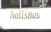
So, when I saw the new design for Le Cirque du Nottinghamshire County Council’s bus services, I can honestly say it took a while for it to sink in.Without a word of a lie, I had to see the thing over several weeks for it to click that there wasn’t a new company called ‘Nolls’ who had taken over many bus routes. It was, in fact, an extremely poor logo advertising ‘Notts Bus’ – obviously created in-house using the most basic of resources.
It appears to be mandatory if you work for a Nottingham-centered council to have an arrow in your name somewhere (maintains the link with Robin Hood, of course). In this case, the arrow is about 50% too high to make any sense – it looks like something a 4 year old would write when they are learning how to do ‘t’s!
I should imagine the council saved tens of thousands of pounds by not having it done properly. Of course, they also wasted thousands of pounds by doing it badly instead. They’ll change it soon, I predict.
